In my previous post this morning, i spoke about some pictures that I wasn't too happy with, and so I painted over them. I felt, in each case, that since i didn't like the painting anyway, I could afford to take some risks because if it didn't work, there was nothing to lose. It is quite liberating when you can attack a canvas like this, so it frees you up to be experimental and bold.
Some were more successful than others, but I learned a lot in the process. In fact all are sold, the only one I have left is the trees, because I won't sell them. So something must have worked!
 The landscape on the left just seemed bland to me, it wasn't really saying anything. So I played around with purple and turquiose, and it seemed to give the forest an interesting atmosphere, but it still needed something, so I added the guy with the bicycle.
 The painting on the left is the beach and lighthouse at Cape St Francis, after a storm. There was a sort of lagoon on the beach caused by very high tides. Although this is as it looked in the photo, the composition was just not working for me. I hated the way the dune cut the picture in half and blocked the flow of your eye. So I painted it out. But after a day or so, the colours had subtly bled through, so if you look at the one on the right, you can still see the top of the dune showing subtly through the sky! It wasn't planned but I liked it, it sort of looks as if the coast carries on, fading into the distance.
 (as in the detail here) and so i started playing with the little windows, and it took on a life of its own.


This is a scene on the Transkei Wild Coast, but I hated it, so at first I thought I would just jazz it up a bit. That was worse, so then I just went ballistic! Again the windows peep through, and there are hints of a landscape, some of the shapes still show, but it has much more atmosphere.

 This one is a famous terrace of cottages just round the corner from our home. But they lacked something, so one night they got "the treatment". I have kept them and never exhibited them because I really like the result.
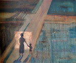
 This is one of my favourites, to this day I am sad I sold it. The underpainting was an unsuccessful nude with a sort of diamond patterned background. Unfortunately I never photographed it, or maybe it is fortunate because it was really bad! I painted the whole canvas with magenta, because it iwhich is quite transparent, the texture of the underpainting shows through and adds interest to the background of this one. Just before the magenta was dry, i painted the figure on top, and after a couple of days, it "bled through" and subtly tinted the painting, which gives it a unity of colour.


3 comments:
I guess it's the same as my gardening; a tweak here and there, plants moved about, looking for texture combinations....... Although I've no artistic talent I did attempt a watercolour of part of the garden many years ago (just for fun)....I must try and find it
Rx
Some day someone may spend hours removing the top layer of paint to see what is underneath....like they do with some old masters' work!
A collection of beautiful paintings.
Post a Comment